
Here’s something that confused me for really long time: copperplate isn’t really the name of a handwriting style. Not originally, anyway. It’s a printing process. The beautiful script people use on wedding invitations got its name from sheets of metal, and the deeper you dig into why, the more interesting the story gets. It runs through engravers, merchants, steel-pen factories, and a couple of writing masters who genuinely couldn’t stand each other.
So let’s get into it.
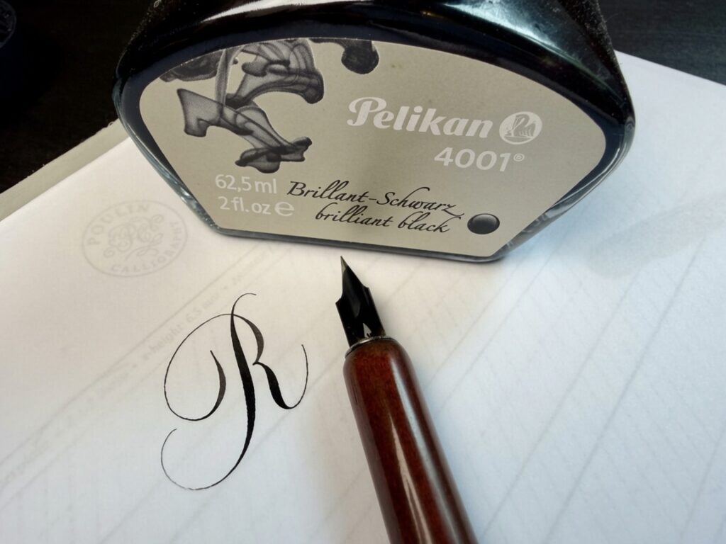
A letter R in copperplate using a Leonardt Principal EF nib.
First, the metal
The story starts in the 1430s and 40s, when engravers in Germany and northern Italy began carving images into polished copper plates. The tool was a burin, a small razor-sharp chisel you push through the metal to cut a clean groove. Rub ink into those grooves, wipe the flat surface clean, then press damp paper against it under serious pressure, and the paper pulls the ink back out of the lines. That’s intaglio printing, and the thing it does better than anything before it is thin lines. Really thin. Hair thin.
That precision mattered for handwriting. The older method, the woodcut, worked the opposite way: you carved away the wood to leave a raised line, which gave you something blocky and heavy. Copper could do the opposite of blocky. It could taper a stroke off into nothing and hold a curve so fine it looked drawn by a pen. If you wanted to reproduce elegant penmanship, copper was simply the best material available.
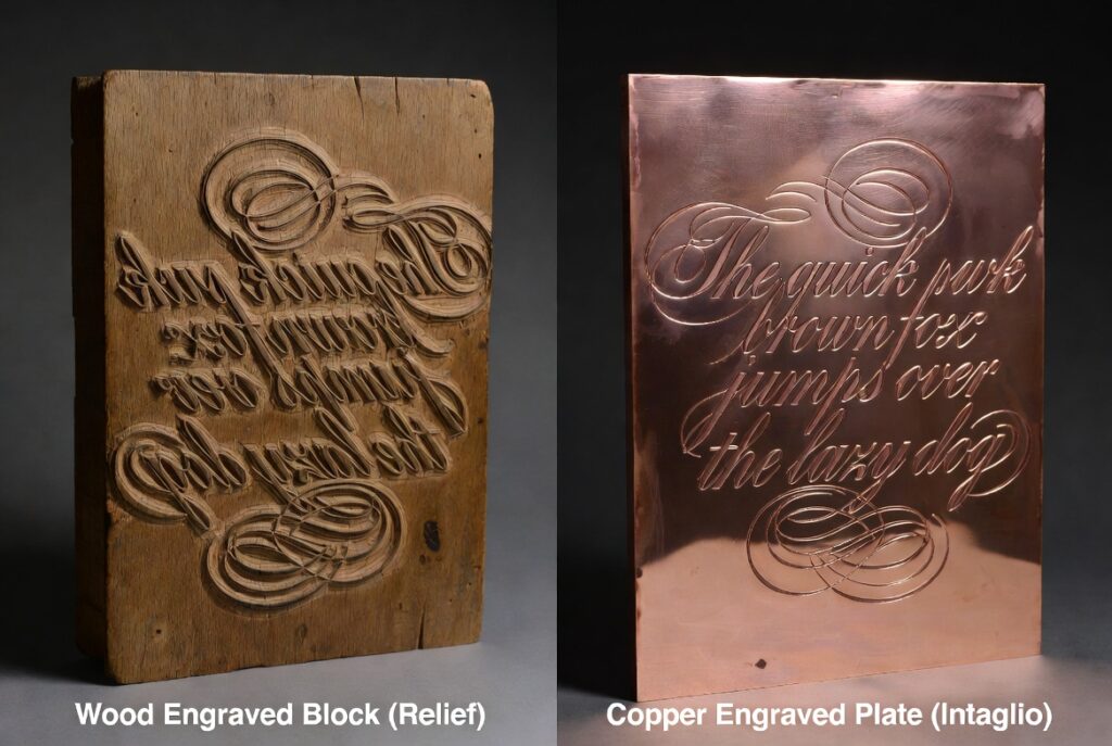
The two methods are mechanical opposites: a woodcut prints from the raised surface left behind after you carve the wood away, while an engraving prints from the lines cut into the metal. But the part that still amazes me is because the paper presses straight onto the plate, the print comes out mirrored. So the engraver had to cut everything backwards. Scripts are hard enough to master the right way round. Imagine learning to do it flawlessly in mirror image, by hand, into solid metal. That’s the kind of skill that takes decades to build.
The writing masters cash in
By the 1500s and 1600s there was a whole trade built on all this: the writing master. These were the celebrities of their craft, teaching merchants, clerks, lawyers, and the children of wealthy families how to write beautifully. And they were shameless self-promoters. To drum up business they published “copybooks,” collections of model alphabets and show-off paragraphs that students copied over and over until their hands obeyed.
And the compensation for this craft was substantial. The Zanerian Manual, published in 1924 and still treated as something of a copperplate bible by calligraphy students around the world, highlighted that exact fact. Skilled engrossers, it noted, could pull in upward of $5 an hour. Scale that against today’s wages based on inflation and you’re looking at roughly $90 to $100 an hour. That’s a very healthy income in any era. For comparison, the US federal minimum wage today sits at $7.25.
“It is no uncommon thing for skilled engrossers to receive upward of $5 an hour for their efforts. Persons who make the proper use of this book will find it a money maker.” — The Zanerian Manual, 1924
Here’s a detail that surprised me: the writing master and the engraver were usually two different people. The penman produced the original by hand, then handed it off to a specialist engraver whose entire job was to recreate every stroke by cutting tiny lines into copper. A single page could take that engraver days, sometimes weeks, before the first copy ever came off the press. These books were feats of craftsmanship as much as they were teaching manuals.
The hand and the plate chase each other
And this is where it gets interesting, because the engraving didn’t just copy the script. It started bending it. An engraver could swell a downstroke and taper it into a hairline far more cleanly than any pen, smooth out a curve past what a quill could manage. The engraved page ended up looking significantly better than the writing it was based on.
So penmen started chasing the engraved look with their actual pens, pushing the contrast between fat and thin further and further to match it. The plate imitated the hand, the hand imitated the plate, round and round, each one nudging the other toward more elegance. That dramatic split between delicate hairlines and bold shaded downstrokes, the thing that makes the script unmistakable, partly came out of that iterative loop.
What it’s actually called
Strictly speaking, the script was never originally called copperplate at all. Its proper name is English Round Hand. “Copperplate” is the nickname that stuck, simply because so many examples of it were reproduced from engraved copper plates.
The style matured in England in the late 1600s and early 1700s, and the timing wasn’t an accident. Britain’s economy was booming, trade was expanding, and businesses needed people who could write quickly, consistently, and legibly – invoices, contracts, ledgers, shipping records, endless correspondence. Round Hand was the business script of its day, more or less what typing is now. Its name comes from the rounded, flowing shapes of its lowercase letters, a clear break from the more angular hands that came before.
The masters took it deadly seriously, sometimes to the point of feuding in public. Charles Snell and George Shelley argued over how much flourishing was tasteful. Edward Cocker, both a writing master and an engraver, churned out copybook after copybook. But the one everybody still points to is George Bickham’s The Universal Penman, engraved and published in London between 1733 and 1741. Instead of showing off only his own work, Bickham gathered examples from more than two dozen of Britain’s finest penmen and engraved every page with astonishing precision. Nearly three centuries later, people learning the script still crack it open.
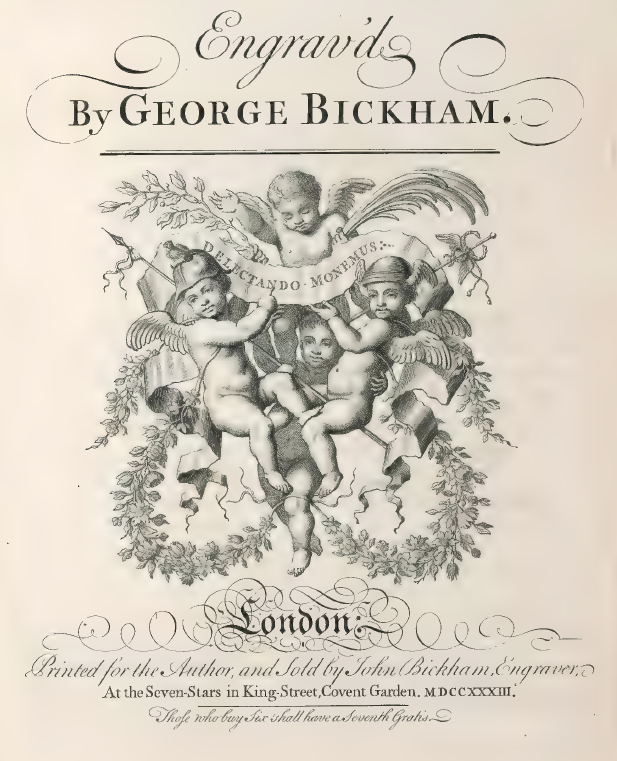
A spread from Bickham’s The Universal Penman (1733–1741).
The whole thing depends on the nib
None of this works without the right pen. Copperplate needs a pointed, flexible nib. Originally that meant a goose quill cut carefully to a fine point; later it meant flexible steel. Either way the mechanism is dead simple: press down and the two tines of the nib spring apart and lay down a broad shaded stroke; ease off on the upstroke and they close back together and leave a hairline.
One small myth worth busting: the oblique pen holder so many calligraphers use today is a later invention. The original masters wrote with straight holders. The oblique caught on in the 1800s because it made the new steel nibs sit at a more comfortable angle for the steep slant of the script (I personally use the straight holder as you can achieve a true copperplate style script. Oblique holders naturally tend to deposit more shade at the bottom of the stroke which lends itself more to a Spencerian style.)
For most of the script’s life, penmen had to cut their own quills, which was its own fussy skill. Then the Industrial Revolution blew the doors off. Starting in the 1820s, Birmingham became the steel-pen capital of the world, with makers like Joseph Gillott and Leonardt stamping out hundreds of millions of flexible nibs a year, cheap enough that ordinary people could buy them. For the first time the tool was everywhere, and so was the practice of it.
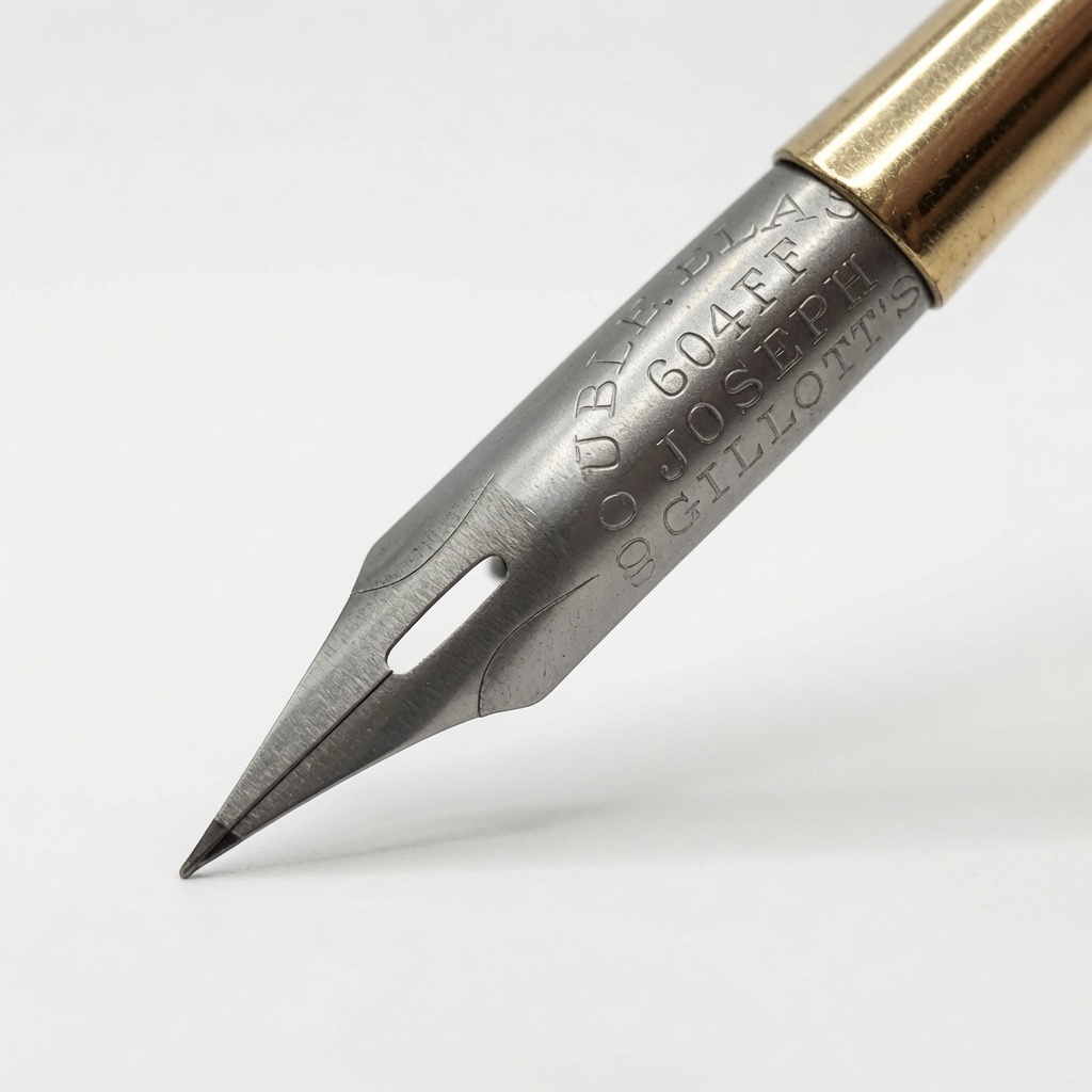
A vintage Joseph Gillott’s calligraphy nib.
It went to America and changed
When the style crossed the Atlantic, it picked up local accents. The most famous descendant is Spencerian, worked out by Platt Rogers Spencer in the 1800s — lighter, faster, and better suited to everyday business writing, but still holding onto plenty of copperplate’s elegance. You’ve almost certainly seen it: the original Coca-Cola logo is Spencerian, which tells you how dominant it was as an American business hand.
Later came the Palmer Method, which sanded off most of the flourish in the name of speed and got drilled into North American schoolkids for decades. There was also Engrosser’s Script, a slower, almost drawn take on English Round Hand that’s still the go-to for diplomas, certificates, and formal work.
How it nearly died
The irony is that the technologies which spread writing around are the same ones that killed off the beautiful version. The typewriter replaced handwritten correspondence. Carbon copies replaced handwritten ledgers. Then the ballpoint pen took over everyday writing, and a ballpoint rolls across the paper on a rigid tip. There’s no give in it, so it simply can’t make the thick-and-thin contrast the whole script is built on. By the middle of the 20th century, the flexible pointed pen had basically dropped out of daily life.
And how it came back
It never fully vanished, though, and lately it’s been having a real moment. A renewed appetite for craftsmanship and slow, handmade things — in a world where everything else is a screen — has pulled pointed pens back into a lot of hands. Wedding invitations. Luxury branding. Certificates. Fine stationery. Modern calligraphers study the same historic copybooks, hunt down vintage nibs, and practice the same strokes the old masters perfected.
And there’s something genuinely satisfying about watching a thick shaded stroke melt into a hairline with nothing more than a flexible nib and a bit of careful pressure. Which is a decent place for this to land: a style of writing that was born imitating engraved copper, nearly wiped out by cheaper pens and faster machines, and kept alive today mostly by people who just like the way it feels to make beautiful letters by hand.
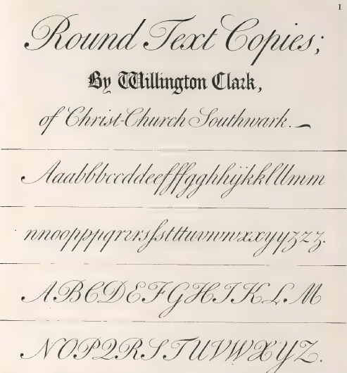
A copy from Bickham’s The Universal Penman (1733–1741).